da ba dee da ba dye.
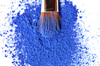
Pablo Picasso had the right idea with blue. But the color can be a bit dreary alongside a moody monochromatic palate (like the painter’s more famous morose works) or when paired with muted or neutral tones, like the familiar Facebook interface. However, Spring 2014’s cheerful Caribbean-inspired colors [below] have made way for the otherwise timid cousin of cornflower to take center stage as Dazzling Blue.
Selected as the color of spring 2014 by Pantone, Dazzling Blue will be the go-to color for interior and fashion design in the coming year. “For more than 20 years, Pantone, the global authority on color, has surveyed the designers of New York Fashion Week and beyond to bring you the season’s most important color trends. This report previews the most prominent hues for spring 2014.”
“This season, consumers are looking for a state of thoughtful, emotional and artistic equilibrium,” said Leatrice Eiseman, executive director of the Pantone Color Institute. “While this need for stability is reflected in the composition of the palette, the inherent versatility of the individual colors allows for experimentation with new looks and color combinations.”
“Three very adaptable pastels sit on one end of the palette,” she explains, “and, because we are so accustomed to seeing them as nature’s background, they can be creatively combined with any other color in the spectrum.” Eiseman is referring to pale Placid Blue, serene Violet Tulip, and soft green Hemlock.
Sand, a toasty beige, and Paloma, a smooth silver, serve as the neutrals. Muted red Cayenne, terracotta Celosia Orange, and vibrant yellow Freesia round out the selections, with brights like Radiant Orchid and the darling Dazzling Blue anchoring the far end of the Spring spectrum.
As a collection, there is definitely a breezy feel that evokes a tropical essence or a cool oasis in the desert. There is certainly a noticeable shift away from jewel-tones, like this year’s Pantone color Emerald Green, for example. The 2014 palate seems it would be simple to incorporate without being too overt. How will you utilize the tones when the time comes next year? — Casandra Armour